

FanFrame — a digital home for Reading FC matchday memories
**Role**
UX/UI Designer (individual project). Research, concept, user flows, wireframes, prototyping and UI development.
UX/UI Designer (individual project). Research, concept, user flows, wireframes, prototyping and UI development.
**Platform**
Mobile (iOS)
Mobile (iOS)
**Timeline**
[24 weeks]
[24 weeks]
---
## Overview
FanFrame is an app concept I developed in response to the "Brand Beyond the Product" brief from Interstate Creative Partners. The brief asked us to design a digital experience for a brand of our choice that moves beyond transactions and into something more meaningful — earning a share of someone's life, not just their wallet.
I chose Reading Football Club as the brand, and built FanFrame around a simple idea: matchdays are full of small, brilliant moments — the pre-match walk to the ground, a last-minute winner, the dodgy chips at half-time — and most of them get lost. FanFrame is where fans can capture, share and look back on them.
The app sits inside the Reading FC ecosystem ("Powered by Reading Football Club") and is designed to feel like part of the club rather than a separate product.
## The Brief
The Interstate brief framed a real shift happening in the way people relate to brands. Cost of living, declining trust in product quality, and a sense that everyday life is increasingly transactional has left people wanting more from the brands they engage with — connection, care, a sense of being part of something rather than just being sold to.
The ask was to design a digital experience that responded to that. Something that communicates value through usefulness and emotional resonance instead of price, and that adds to people's lives rather than extracting attention from them.
I took that thinking and applied it to football, where the relationship between a brand and a person is already deeper than almost any other category.
## The Challenge
Football clubs have one of the strongest emotional pulls of any brand — fans don't really choose them, they inherit them. But most of a club's digital touchpoints sit firmly in the transactional space: buying tickets, checking fixtures, watching highlights, ordering shirts. The deeper part of being a fan — the friendships, the rituals, the shared memories — barely lives anywhere meaningful.
The main design challenge was:
**How might we create a space where Reading FC lives alongside the matchday, not just at the point of purchase?**
That became the question driving the whole concept.
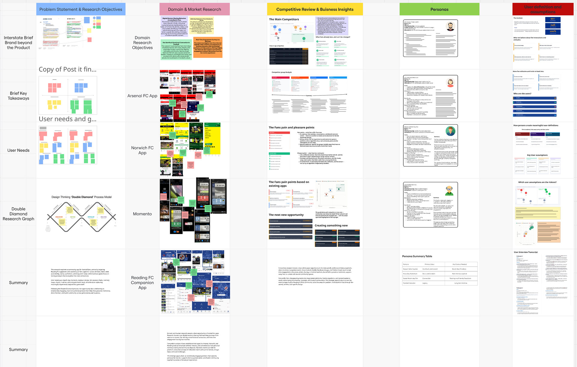
## The Research
I started by mapping out a typical matchday for a Reading fan — what people do before the game, during the game and after, and where the moments worth remembering actually happen. I also looked at where fans currently share matchday content (mostly Instagram, group chats and Snapchat) and what gets lost in those scattered conversations.
A few things came out of it:
- Matchday memories tend to fragment across platforms — photos in one place, group chat banter in another, away-day stories nowhere in particular.
- Fans naturally collect things — scarves, programmes, ticket stubs — and there's a real appetite for digital equivalents.
- A lot of what makes matchday matter is the everyday stuff: the food, the away trips, the unexpected results, the people you go with — not just the official highlights.
- Fans naturally collect things — scarves, programmes, ticket stubs — and there's a real appetite for digital equivalents.
- A lot of what makes matchday matter is the everyday stuff: the food, the away trips, the unexpected results, the people you go with — not just the official highlights.
That research gave me the foundations to start shaping the app around real fan behaviour rather than what a club's marketing team might assume.
## Developing prototypes
The design approach was built around three things: making it feel unmistakably Reading, keeping the journeys simple, and giving fans somewhere they'd actually want to spend time.
I worked in Figma with sandbox spaces for each section so I could try layout variations and visual ideas before committing. The Reading FC pattern became the visual thread holding the whole app together — running quietly in the background of most screens so the app always felt like it belonged to the club without needing to shout about it.
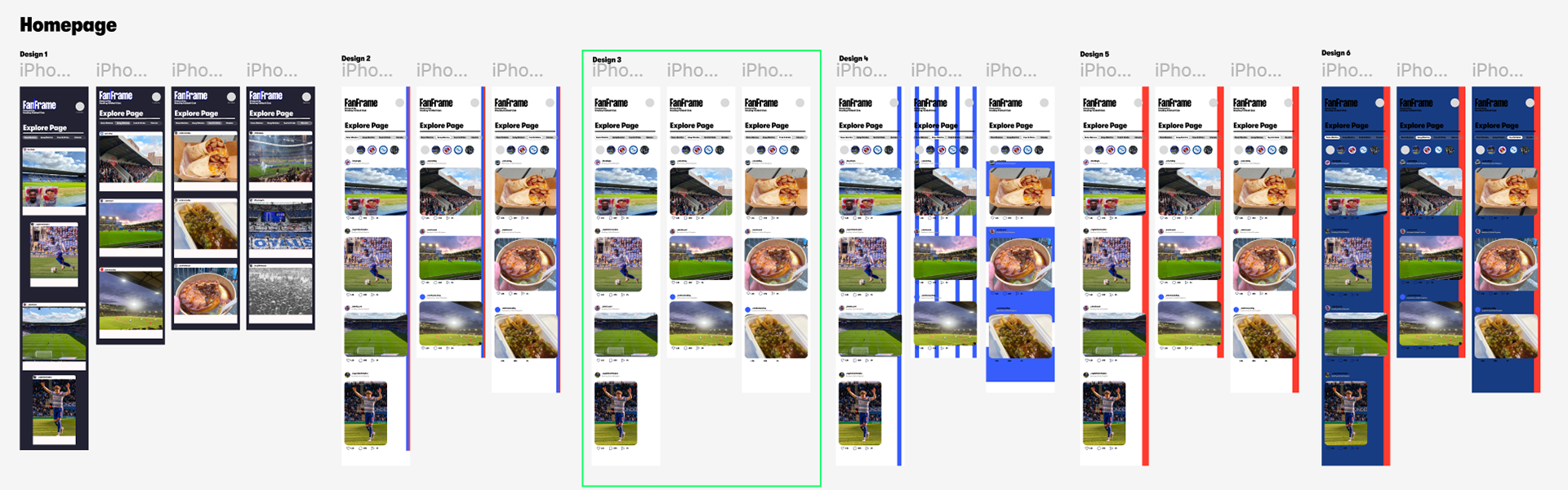
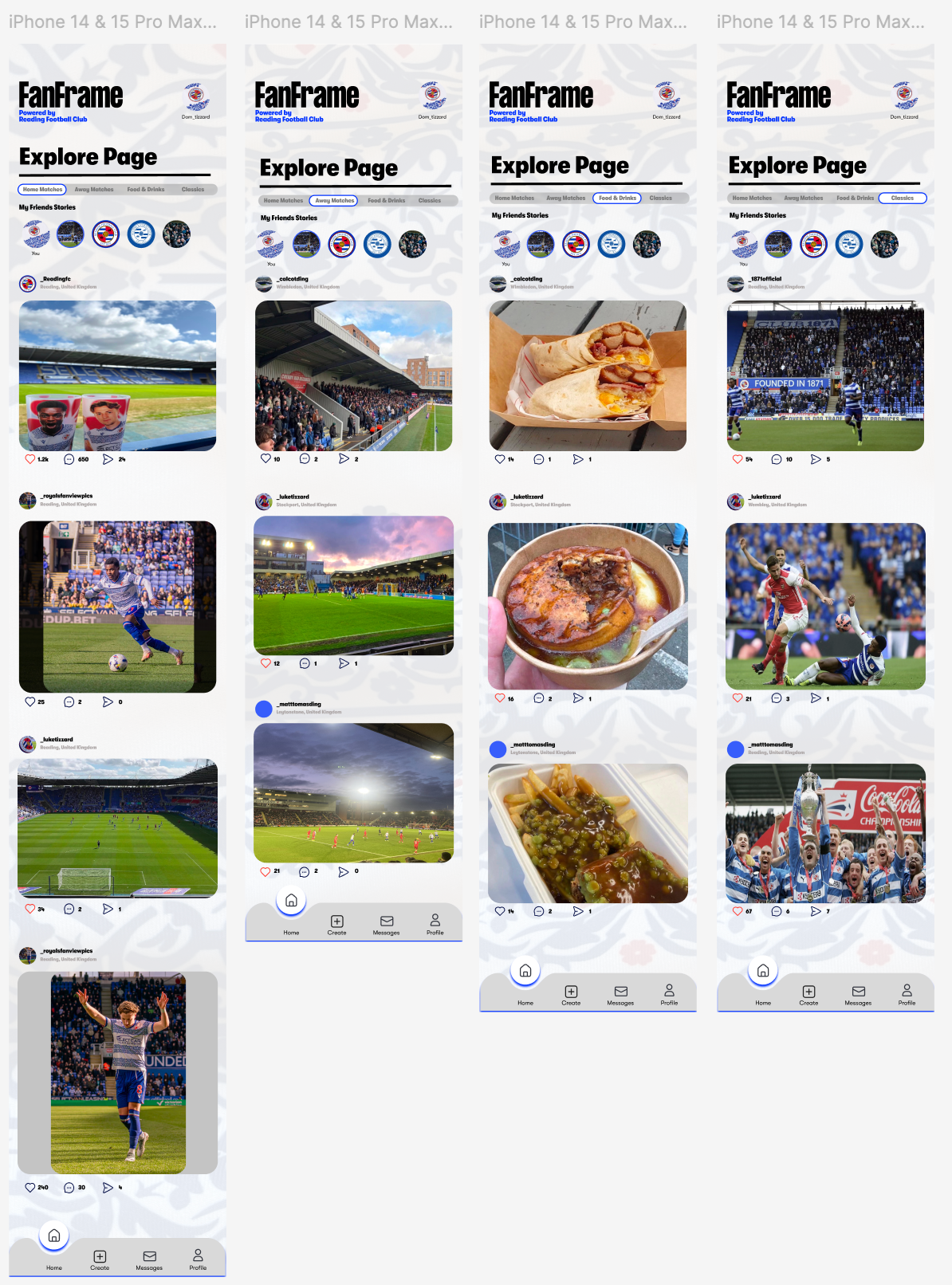
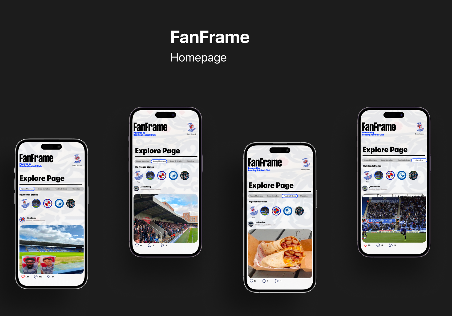
### Home (Explore Page)
A feed of fan-created content, filterable by Home Matches, Away Matches, Food & Drinks and Classics. Stories sit at the top, scrollable posts below. The aim was for this to feel familiar — close enough to the social apps people already use that it doesn't need explaining, but with the visual identity making it clearly Reading.
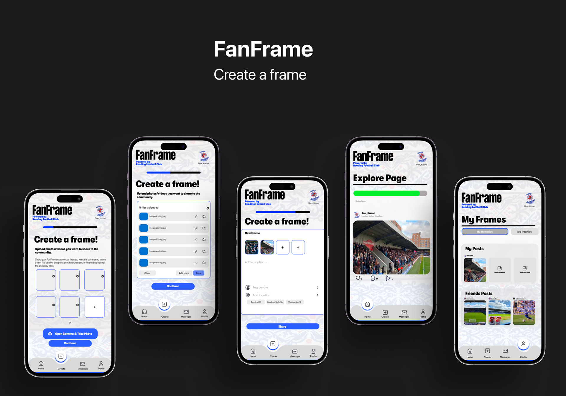
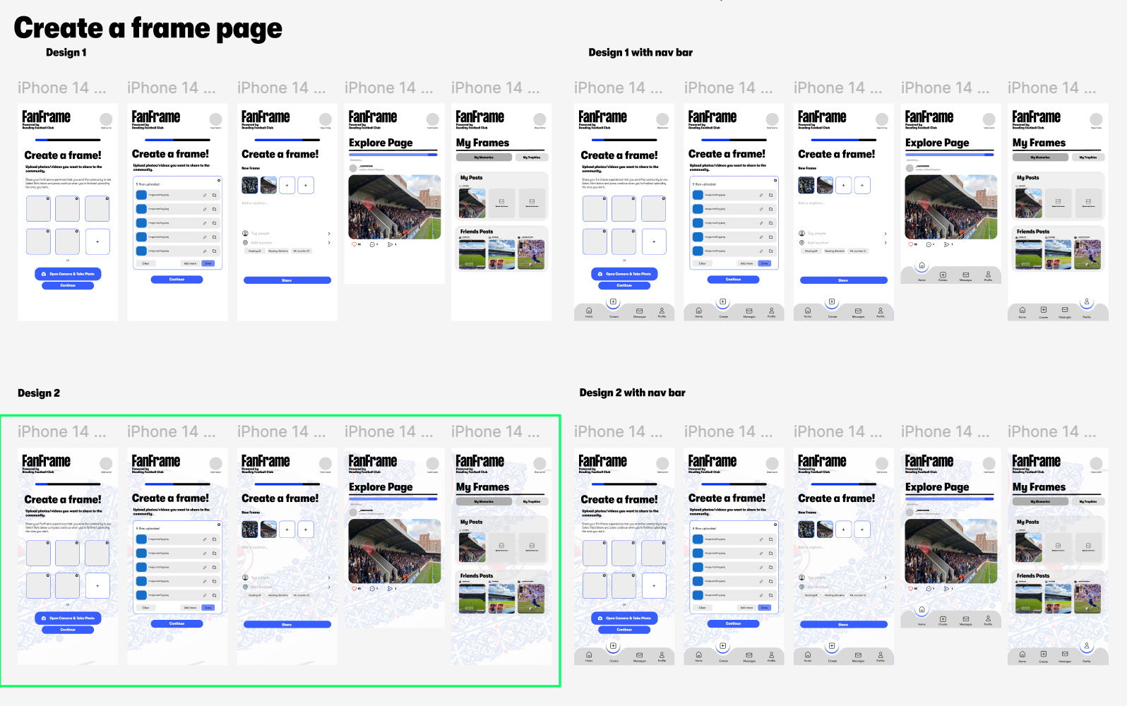
### Create a Frame
A step-by-step flow for posting a "frame." Upload photos or take a new one, review the files, add a caption, tag people, add a location, share. The progress bar at the top was important — I wanted the upload journey to feel guided rather than overwhelming, especially for users who aren't already fluent in Instagram-style posting.
I tested two directions for this flow. Design 1 was more standard — flat buttons, white background. Design 2 used the Reading pattern more boldly across the screens, which made the upload feel part of the club rather than a generic form. I went with Design 2.
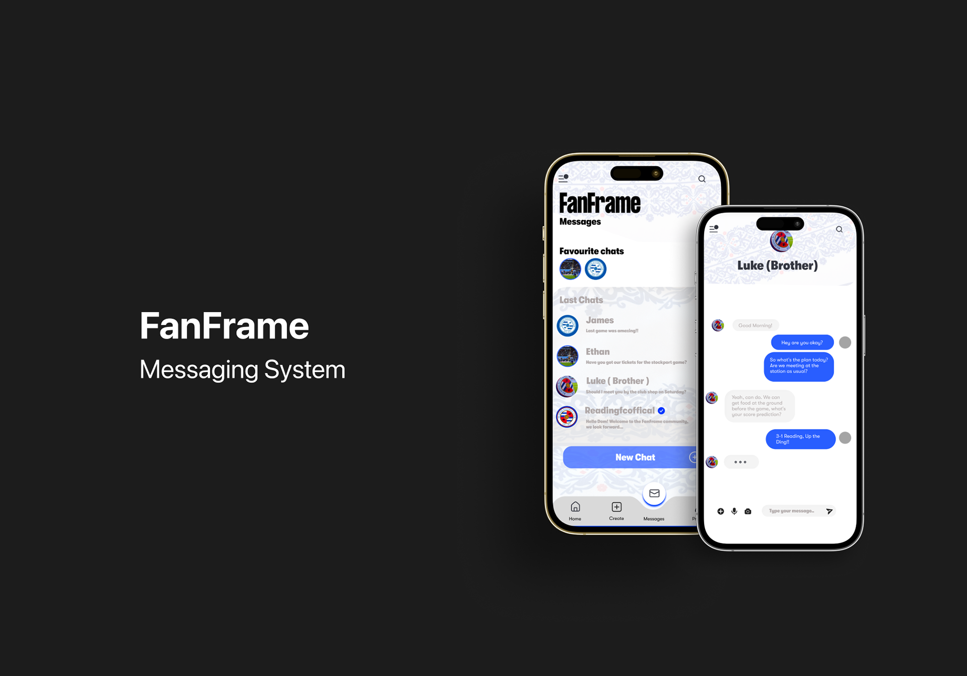
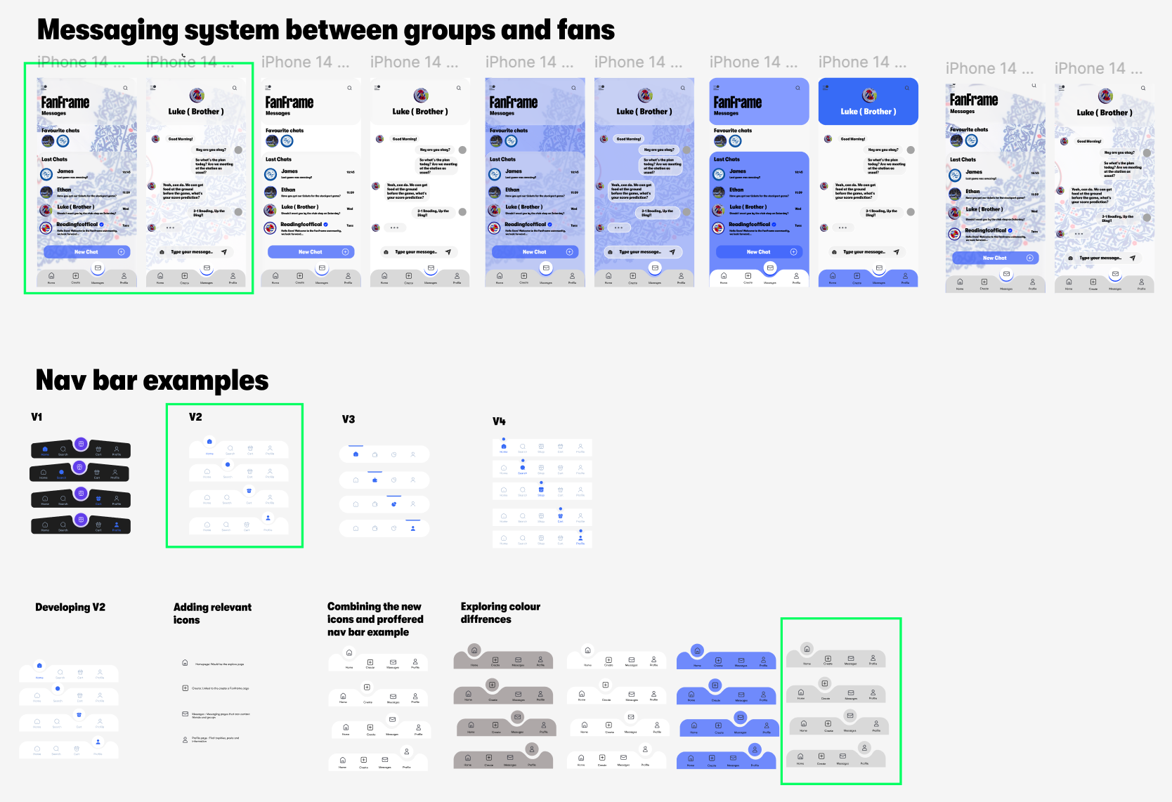
### Messages
A chat space between fans and groups, so the conversations that already happen on matchday have a natural home inside the app. I went through several visual iterations here — testing different background treatments and chat bubble styles — before landing on a cleaner version where the pattern sits more subtly behind the content. Function had to win over decoration.
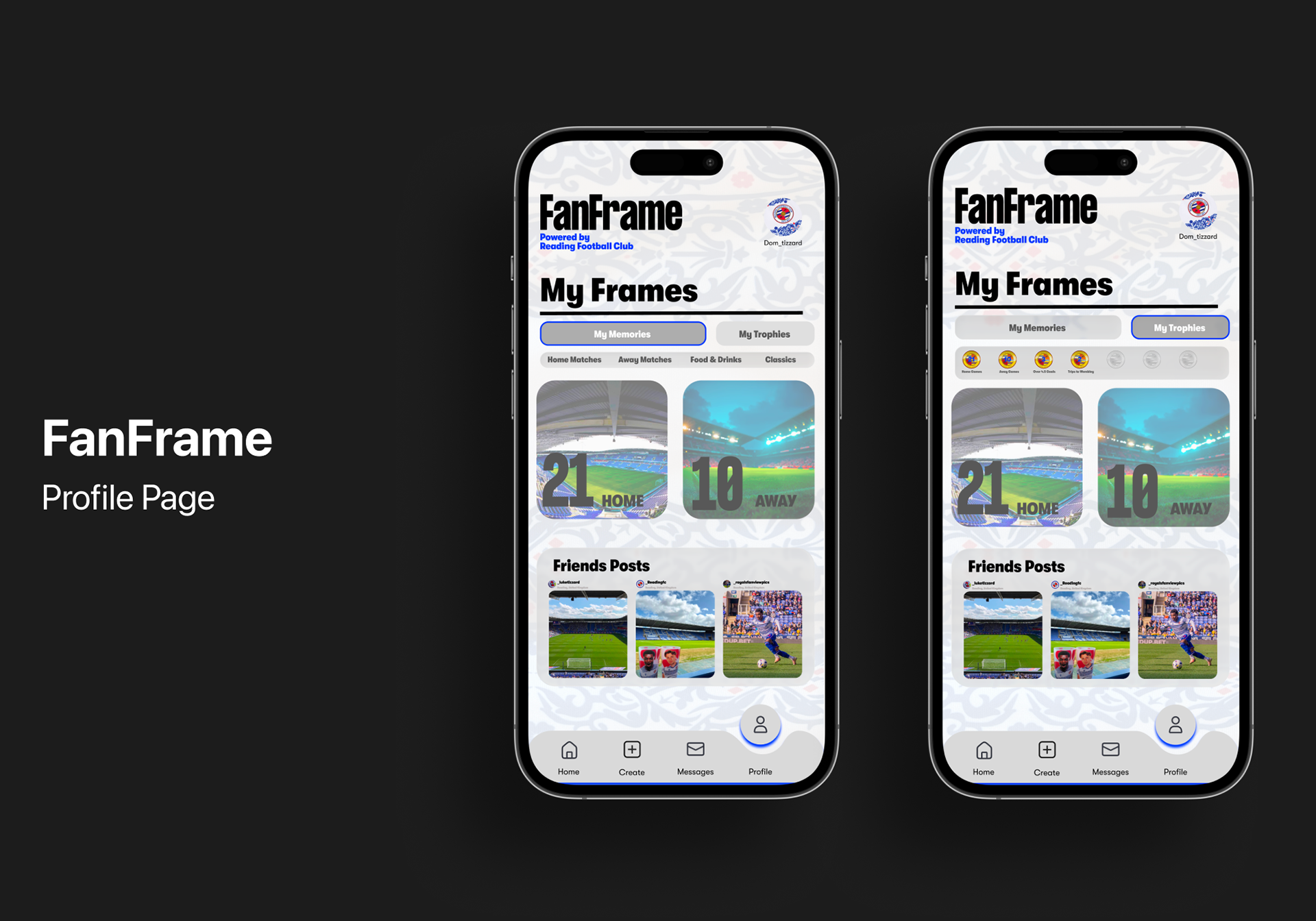
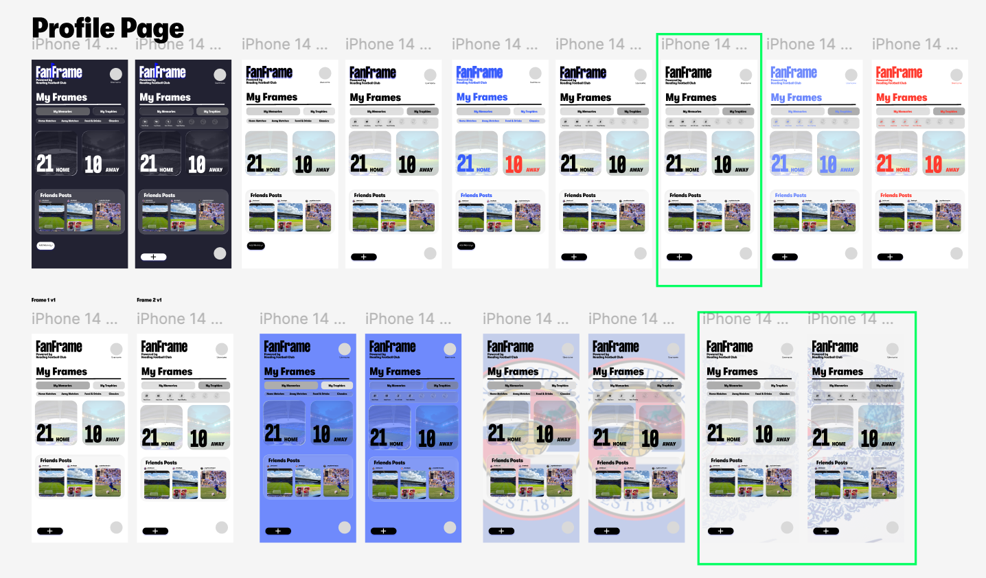
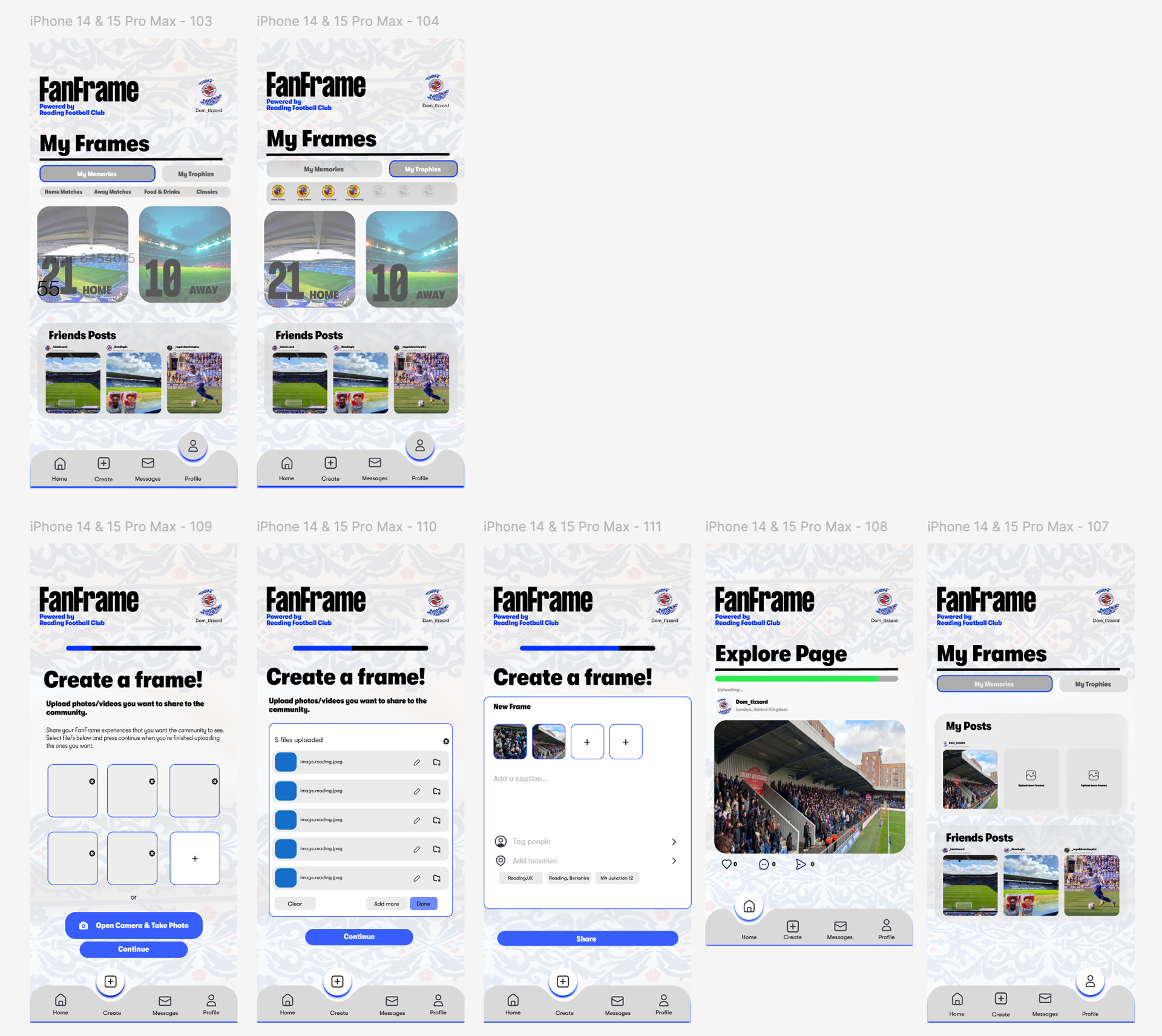
### Profile (My Frames)
Split into two tabs: **My Memories** (your own posts, organised by category) and **My Trophies** (badges earned for things like home and away attendance, high-scoring games, trips to Wembley). The trophy system is where I leaned hardest into the brief — turning loyalty into something tangible and personal without making it feel like a points scheme.
### The nav bar
The bottom navigation went through four versions before I settled on V2, then iterated again to refine icons, spacing and the active state. The final version uses a subtle lift on the selected tab — small detail, but it gives the nav a bit of personality without getting in the way of the content.
## Redesign
The final concept brought all of the above together into a working prototype across the four core sections — Home, Create, Messages and Profile. Each part was designed to feel consistent, easy to navigate, and clearly part of the Reading FC world.
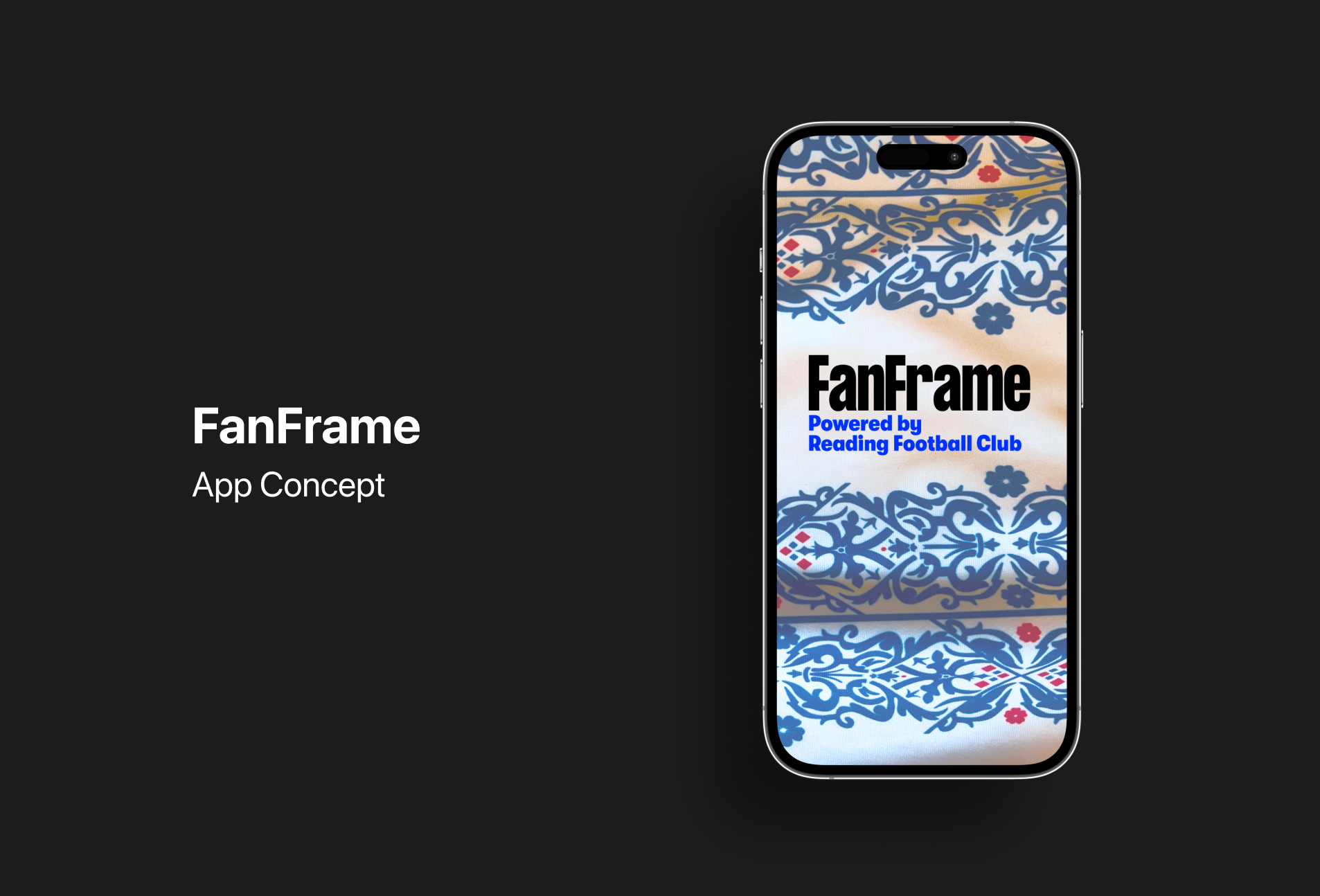
### App Concept
The opening screen leans into the Reading pattern as a hero moment — bold, recognisable and immediately tied to the club. From there, the app unfolds into the more functional, content-led pages without losing that visual thread.
### Profile Page
The Profile page is the heart of the app for returning users. The Memories tab gives fans a personal archive of their matchday content, organised by category, while the Trophies tab gives the club a meaningful way to recognise different kinds of loyalty — not just spend, but actual presence over time.
### Create a Frame
The final Create flow takes a user from upload through to share in a clear, step-based journey, with the Reading pattern reinforcing brand at every step. This was the screen I was most concerned with getting right — if posting feels heavy, the whole app falls down.


## Project Summary & Evaluation
FanFrame is the first project where I had to think about a brand as a relationship rather than a product, and the brief really pushed that. Designing it meant spending more time than usual on the upstream questions — what's the actual matchday like, what's missing, what would a fan want from a club that they don't already get? — before any visual work started. Those questions shaped the whole app, more than any single design decision did.
I also learned a lot from running a project this size on my own. Owning everything from research and concept through to UI, components and prototyping meant I had to stay disciplined about scope. There are several features I sketched and chose not to build, and knowing when to stop was as much a skill as designing the screens. Working at a system level — consistent components, the Reading pattern as a brand thread, the nav as a stable backbone — was what kept the whole thing hanging together.
The biggest takeaway was that "brand beyond the product" isn't really about adding more touchpoints — it's about designing ones that genuinely give something back. FanFrame's job isn't to sell anything. It's to give Reading fans a place to be Reading fans, and let the club show up usefully in that. That shift in framing is something I'll carry into future briefs, regardless of the category.